Blog

IGOR Fall Salon Online Exhibition Acceptance
8/31/2023 10:38:20 AM | By Holly Bedrosian | Comment on this

I received the good news today that my oil painting, Remembering When has been accepted into the International Guild of Realism Fall Salon Online Exhibition! This exhibition will have about 200 realist artworks by artists from over 20 different countries. The show will run from October 20th through December 20th at https://www.realismguild.com/
This painting is one of several works I have done of this model. Some are in oil, and some colored pencil. I find that switching between media helps me to grow as an artist. Here are some other works I have done of this model:
Colored pencil:


Oil:


Drawing the Face in Colored Pencil
8/30/2023 5:53:01 PM | By Holly Bedrosian | Comment on this
The most important thing to learn before embarking on drawing the face in colored pencil is how to draw the face in pencil. So the first thing I recommend doing is practicing with pencil on sketch paper or a sketch pad.
Anatomy
The basics anatomy of the human face are integral to creating a realistic portrait.
To begin, the face can be divided into thirds. The upper third extends from the hairline to the brow line, the middle third from the brow line to the bottom of the nose, and the bottom third from the bottom of the nose to the base of the jawline. This general rule will help keep your proportions in check.
Although facial features vary from person to person, there are some rules or guidelines can help establish feature placement. The ears should extend from the bottom to just shy of the top of the middle third. If you divide the middle third vertically into quarters, the second quarter from top will be approximately where to place the eyes. The mouth should fall approximately one third from the top of the bottom third. The mouth corners extend outward in line with the center of the eyes.
Practice each facial feature separately, and then practice placing the features correctly in proportion with the rest of the head.
For more practice, check out this guide on how to draw portraits:
Adding Color
Once you have mastered drawing in graphite, it is time to move on to drawing the face with colored pencils. My drawing process begins with sketching the proportions lightly using graphite pencil to establish the feature placement. This way, any stray marks can be easily erased later on.
You can refer to my previous post on The Best Colored Pencil Brands for Artists and 7 Best Surfaces for Colored Pencil Artists to help decide which materials you will be using. For this tutorial I will be referring to Prismacolor Premier colored pencil colors, but you may substitute with similar shades of your favorite brands.
I start laying down the darkest areas of the face. First, I will use a neutral dark such as Prismacolor Dark Umber or Sepia to establish some of the shadows. One tip is that many people underestimate how dark the areas are under the eyebrows/eyes and also under the lower lip. If you find you are having trouble gauging the dark areas, turn the drawing and reference photo upside down so that you aren't distracted with what you think the features look like.
Here is how I start sketching the face done in dark umber:


The way you apply the pencil will affect the overall look of the drawing. Some people like to use tiny circular motions to create a seamless and smooth effect. Others use vertical strokes to give the drawing more of a "drawing" feel. I personally like to vary the strokes, and also use stroke directionality to establish contours.
Next I move on to using a dark red color such as Prismacolor Tuscan Red to establish dark areas of the nostrils, around the eyes, and other warm shadows such as in the hair.
You may also proceed with other darker tones, but it is important at this point to restrain from using cool darks with black or blue tones as they can appear overly blue when you add light tones later on. It is also important to reserve the white of the paper for the lightest areas of the portrait, especially if you are working on a smooth surface such as Strathmore Bristol Board Smooth.
Next I move on the medium tones. There are a wide variety of medium tones that can be used, sometimes depending on the temperature of the lighting. If you are using Prismacolor, medium flesh tones might include Burnt Ochre, Sienna Brown, Bronze, and Sandbar Brown. At this point you can also start to lay down bright colors such as Poppy Red, Carmine Red, Orange, Yellowed Orange, and Yellow Ochre.
For the next step, I address the lightest parts of the face. My favorite light tones are Beige, Light Peach, Peach, Peach Beige, and even sometimes French Gray 10%. At this point, there will be some medium tones that you can blend with the light tones and blend to achieve a smooth skin appearance.
Here you can see I have established the dark, medium, and light tones of the face:

Completing the Portrait
At this point, I have a good overall basic drawing in colored pencil and I can go back and smooth out areas that need refining. So I continue to cycle through dark, medium, and light tones to achieve a realistic drawing with the goal of smoothing out the skin tones.
I will also start applying cool tones, such as Blue Lake, Jade Green, Lilac, and Sky Blue. To do this, study the face and look for the areas of the skin with subtle cool hues. Typically this may be under the eyes, above the brows, along parts of the hairline, and perhaps some areas around/under the mouth, chin and jawline. Apply blue tones sparingly and step back often to assess the overall balance.
If you find that an area is too warm or too cool, use color theory to adjust the tone. For example, and area with too much red may be toned with with some green. When doing this, be sure to keep in mind overall values as well so as not to overly darken the area. Complementary colors can be used to adjust areas that lean too warm or too cool.
If you are drawing a background, you may want to block that in at this point to make sure that your values and colors are correct in relation to the colors of the background.
Once the background is complete and colors are adjusted, I make final refinements such as hair details, jewelry, smoothing skin, etc.
Here is the finished piece:


AAPL Grand National
8/28/2023 2:47:59 PM | By Holly Bedrosian | Comment on this

I'm very excited to announce that my colored pencil drawing, The Influencer, has been juried into the 95th American Artists Professional League Grand National Exhibition! This exhibition will be held at the Salmagundi Club and run from 11/6/2023 - 11/24/2023 with a reception 11/10/2023 from 5:30 PM – 8:00 PM.


7 Best Surfaces for Colored Pencil Artists (2023)
8/25/2023 10:51:44 AM | By Holly Bedrosian | Comment on this
Choosing the best paper for your artwork is perhaps even more important than choosing the colored pencil brand (see my post on choosing colored pencils here). The options range from smooth paper all the way to sanded boards, with a variety of colors and price points as well. I will go over my favorite surfaces for professional artists working in colored pencil, and discuss the advantages and disadvantages of each of the different brands:
1. Strathmore 400 Series Bristol Board – Smooth
2. Strathmore 400 Series Bristol Board – Vellum
4. Art Spectrum Colourfix Smooth Pastel Paper – Terra Cotta
6. UART sanded pastel paper – 600 or 800
7. Clairefontaine Pastelmat – White, wine, sienna, sand
When you read about each of these surfaces, think about how you work as an artist as the choice is really a matter of personal preference. Do you start with a precise drawing and “fill in” details with a perfectly sharpened pencil? Do you start with broad shapes and lay colors down quickly, while reserving details to the end? Each of these artistic styles is suited to different types of surfaces.
1. Strathmore 400 Series Bristol Board – Smooth
Strathmore Bristol Smooth is the first surface I tried working on with colored pencil. This acid-free heavy weight paper has a very smooth surface, which is ideal for rendering fine details of portraits and other colored pencil drawings. While this is true, the smooth texture doesn’t allow as much layering and you cannot apply light over dark, so you really need to reserve white spaces for the lightest parts of your drawing.
Also, your initial drawing must be very accurate without any stray marks. I usually draw lightly with graphite and erase any marks in light areas before proceeding to applying colored pencil.
Bristol paper accepts all types of colored pencils, so you can choose your favorite to use. For a list of the best colored pencils for artists, see my previous post.
This is a very economical option, as it comes in a pad of 15 sheets.
Finally, because this is white paper, it may be harder to gauge darks and mid tones than when working on a mid-toned paper.
Here is a drawing I did on Strathmore 400 Series Bristol Board – Smooth:
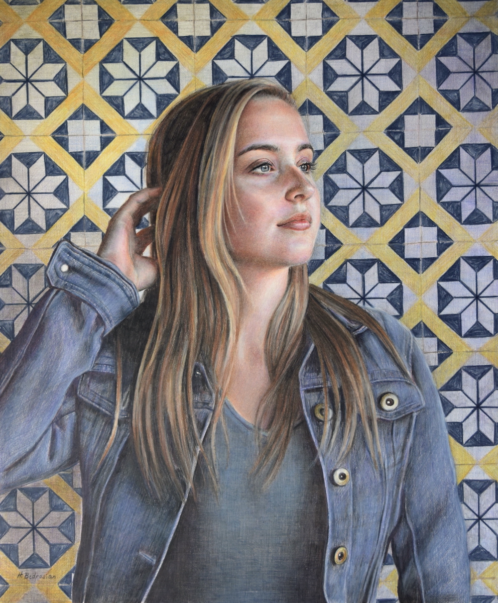
Brooke by Holly Bedrosian
2. Strathmore 400 Series Bristol Board – Vellum
Slightly more toothy than the smooth bristol paper, this vellum surface beautifully accepts layers of colored pencil. While this type of paper may be more amenable to layers of color, you still need to reserve the white of the paper for the lightest areas.
You can still create fine details on this paper despite it’s texture. To allow the surface texture to show through, you can work quickly with a blunt point and graze over the grooves in the paper. If more detail or a smoother look is desired, sharpen the pencil to a very sharp point so you make sure to apply color to the grooves of the paper. Another way to achieve even color application is to “burnish”, or apply the colored pencil with firm pressure.
Priced the the same as the smooth bristol board, this is also an affordable option. In addition, this acid-free paper also accepts a wide variety of colored pencils.
Here is a drawing I did on Strathmore Bristol Vellum:
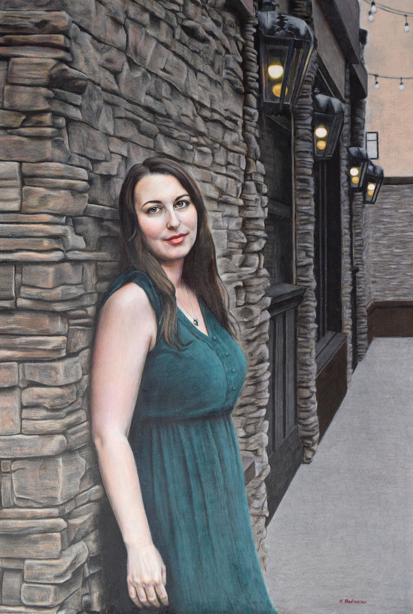
Interlude by Holly Bedrosian
Pastelbord is a durable Acid-free clay and gesso coated Hardbord panel with a marble-dust finish for tooth. Very different from the previous two options, this surface allows for application of lights over darks and you don’t have to reserve white space for light areas as much.
This surface also quickly “eats up” the pencil pigment, so if you like to work quickly, this may be the right paper for you. I prefer to use wax-based pencils as opposed to oil-based pencils on this surface, as the wax seems to adhere better to the surface.
In addition, you can easily apply watercolor pencils underneath (or on top) of your colored pencil drawing as this robust surface will not warp in any way with wet media. I find this technique is a great way to achieve vibrant colors.
Pastelbord is the priciest option on this list, but also the most robust in thickness and durability.
Here is a drawing I did on Pastelbord using Prismacolor Premier colored pencils on white Pastelbord:
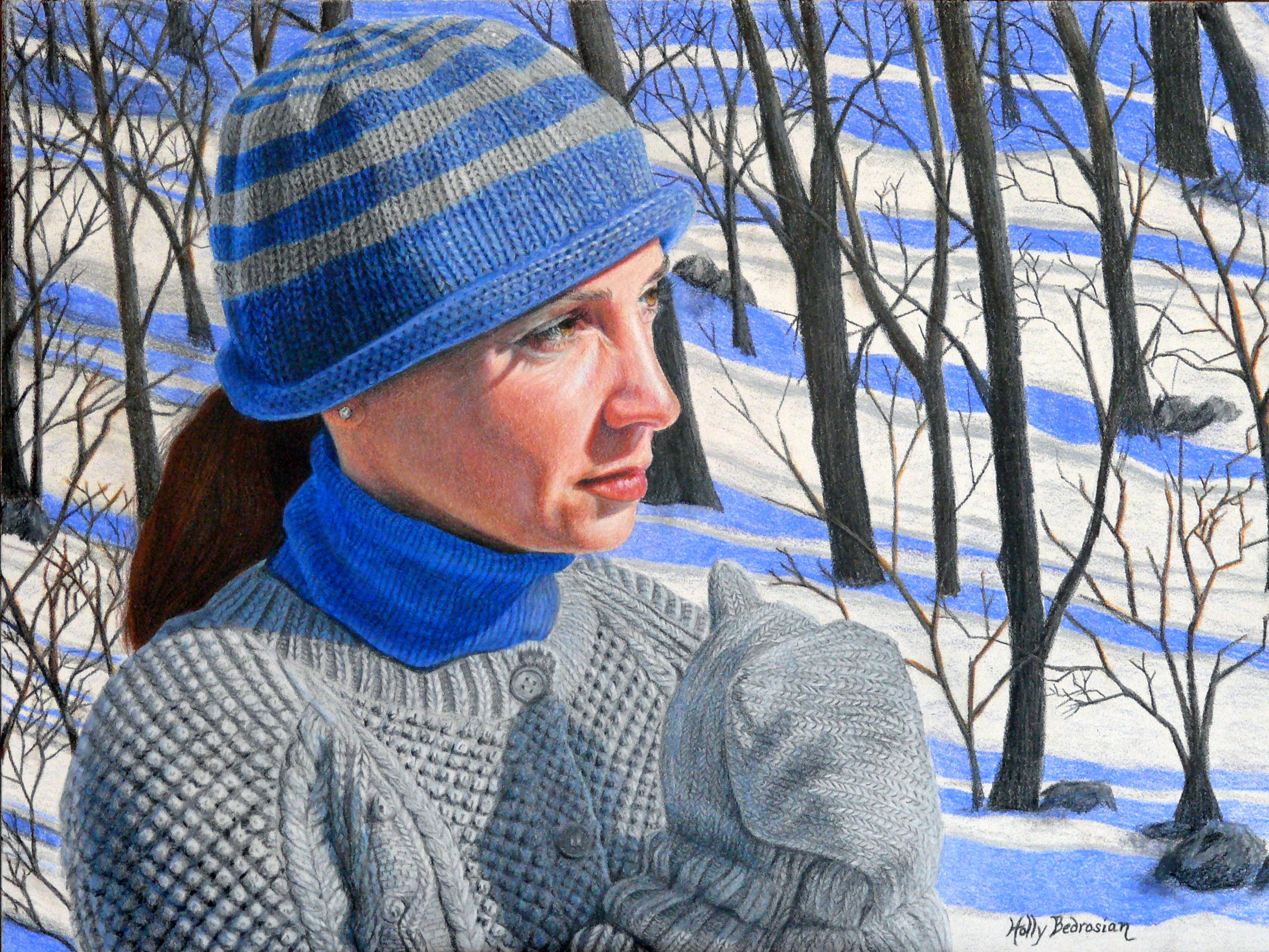
Winter Blues by Holly Bedrosian
4. Art Spectrum Colourfix – Terra Cotta
Art Spectrum Colourfix is an acid-free smooth watercolor paper coated with a textured primer. This toothy surface is a good choice for both wet and dry media and can accept multiple layers.
I especially enjoy working on the vibrant terra cotta toned paper and letting the color “peek through” in my drawings.
Colourfix papers are not as inexpensive as the Strathmore bristol boards, but still relatively low in price.
The drawback is that the texture of this paper is very difficult to overcome if you are looking to achieve a smooth, photorealistic finish.
Here is a drawing I did on terra cotta toned Art Spectrium Colourfix:
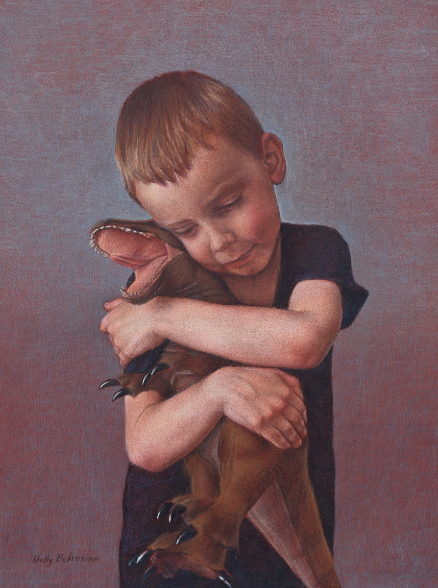
Roar by Holly Bedrosian
Fisher 400 Art paper is a very rough surface not unlike sand paper. However, don’t be deceived by the paper texture – the surface actually grabs so much colored pencil pigment that achieving a smooth effect is quite easy. I also find this paper to be a good option for those who like to lay down color quickly before rendering details.
You can purchase this paper here: https://www.proartpanels.com/fisher400-proart-panels/
This paper makes for easy blending, particularly when used with Faber-Castell Polychromos colored pencils, which act almost as pastel pencils on this surface. You can also use wax-based pencils such as Prismacolor Premier or Caran D’Ache Luminance if you prefer more control (although less blending ability). I will demonstrate the different results you can achieve with this paper in these two examples below:
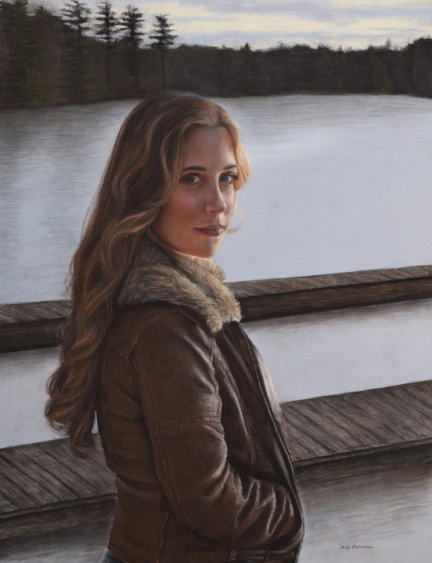
April, Polychromos on Fisher 400, by Holly Bedrosian
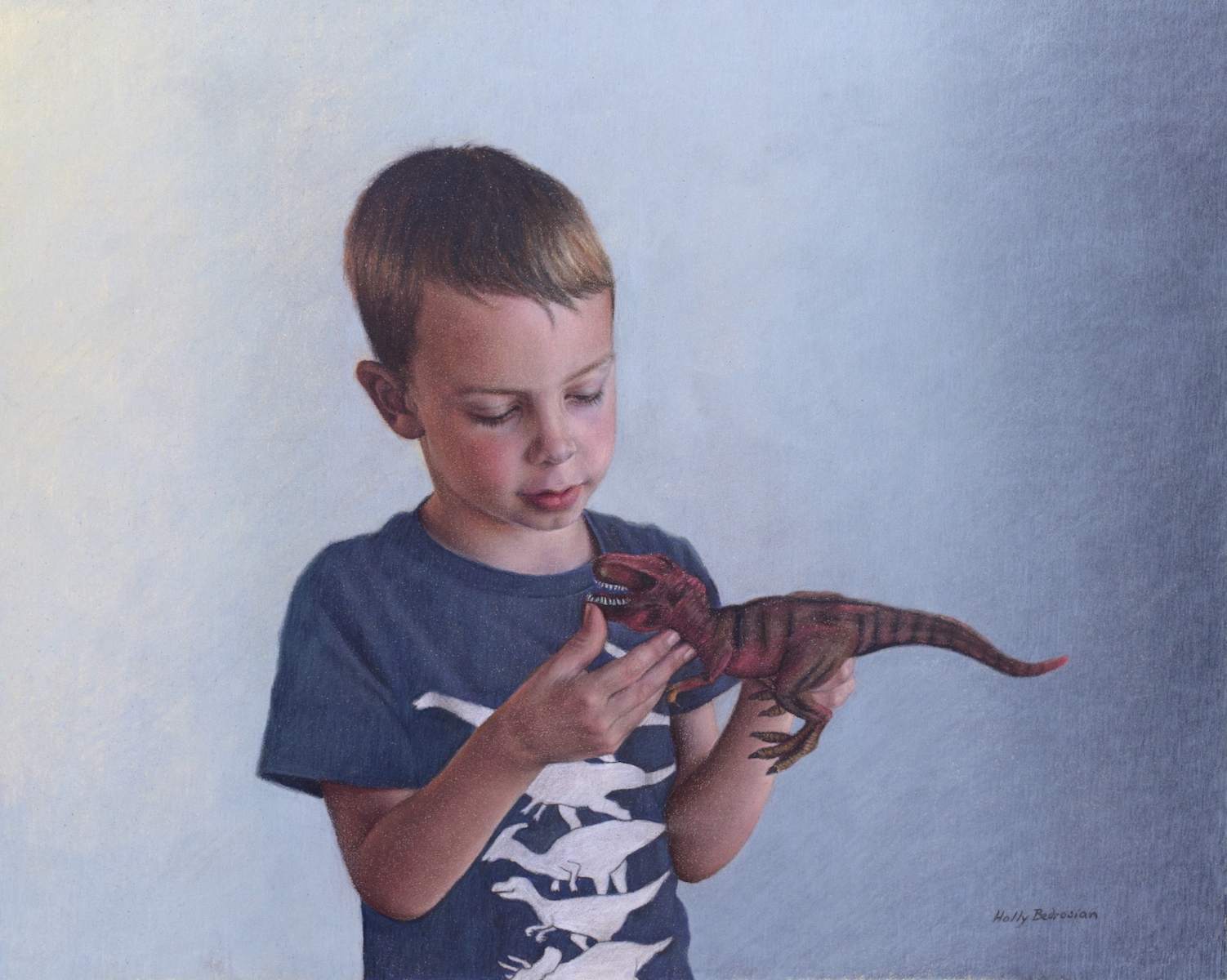
Favorite, Prismacolor on Fisher 400, by Holly Bedrosian
The only con to this paper is that it is very smudgy – you really need to be careful when working not to smear your work as you go. Also, artists who like to do detailed work straight away may not prefer this paper.
Fisher 400 is a mid-priced surface, in-between the price of Colourfix and Pastelbord.
6. UART sanded pastel paper – 600 or 800
UART sanded pastel paper is a favorite amongst pastelists and colored pencil artists alike for its toothy surface and variety of textures. The paper grades (degree of texture) range from 240 with the largest tooth to 800, which has the finest tooth. The paper has a nice weight making it easy to apply several layers of pigment.
UART paper comes in an array of sheet sizes and also mounted boards, and is priced similarly to Colourfix.
I do find the paper texture to have more of a pattern than Fisher 400, so that may be a consideration when deciding on a surface.
Here is an example of a colored pencil piece I did on UART sanded pastel paper 800
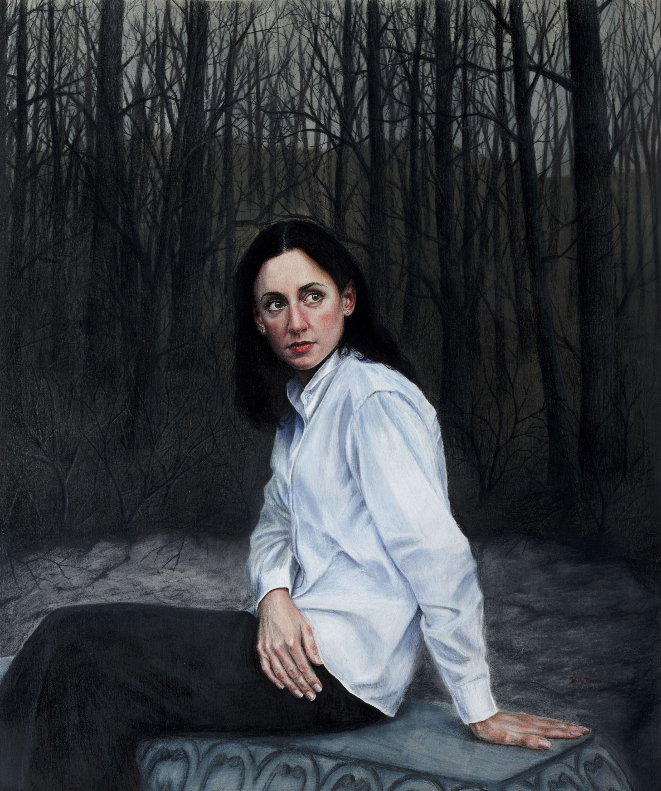
Solitude by Holly Bedrosian
7. Clairefontaine Pastelmat – White, wine, sienna, sand
Clairefontaine Pastelmat is another great surface for pastel artists and colored pencil artists. This heavy-weight paper also comes in a wide range of colors. It is priced similarly to Fisher 400.
I find this surface to be somewhere in-between the Fisher 400 and Strathmore Bristol Board – you can layer and blend somewhat easily, but it is not as smudgy as the Fisher 400. Also, you can achieve fine details, but not quite as fine as the Bristol Board. I do like how you can layer lights over darks on this surface as well (again, perhaps not as much as with the Fisher 400). To me, this is an excellent choice if you want a paper with a little bit of everything, or if you are undecided.
I have worked on white Pastelmat before, and also really enjoy working on the wine, sienna, and sand toned papers. Here are examples of my work in each color:

Unspoken Dreams, White Pastelmat, by Holly Bedrosian
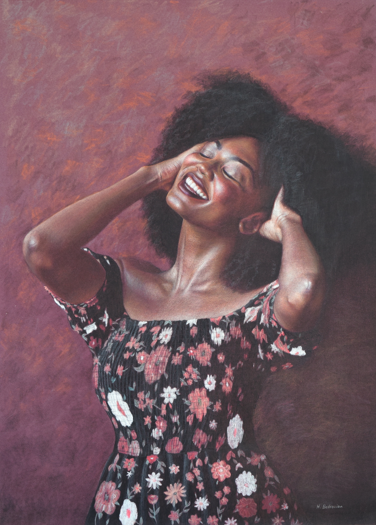
Exuberance, Wine Pastelmat, by Holly Bedrosian
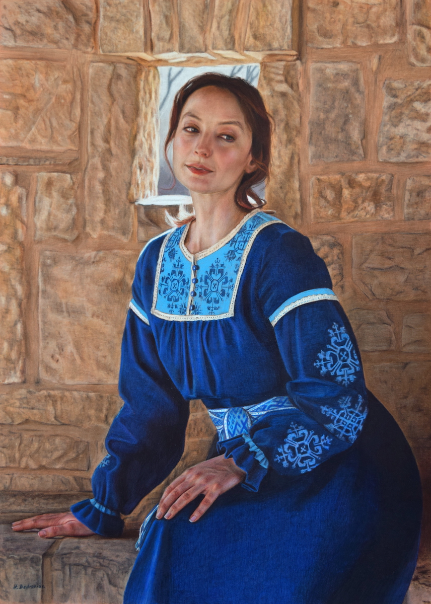
Blue Repose, Sienna Pastelmat, by Holly Bedrosian
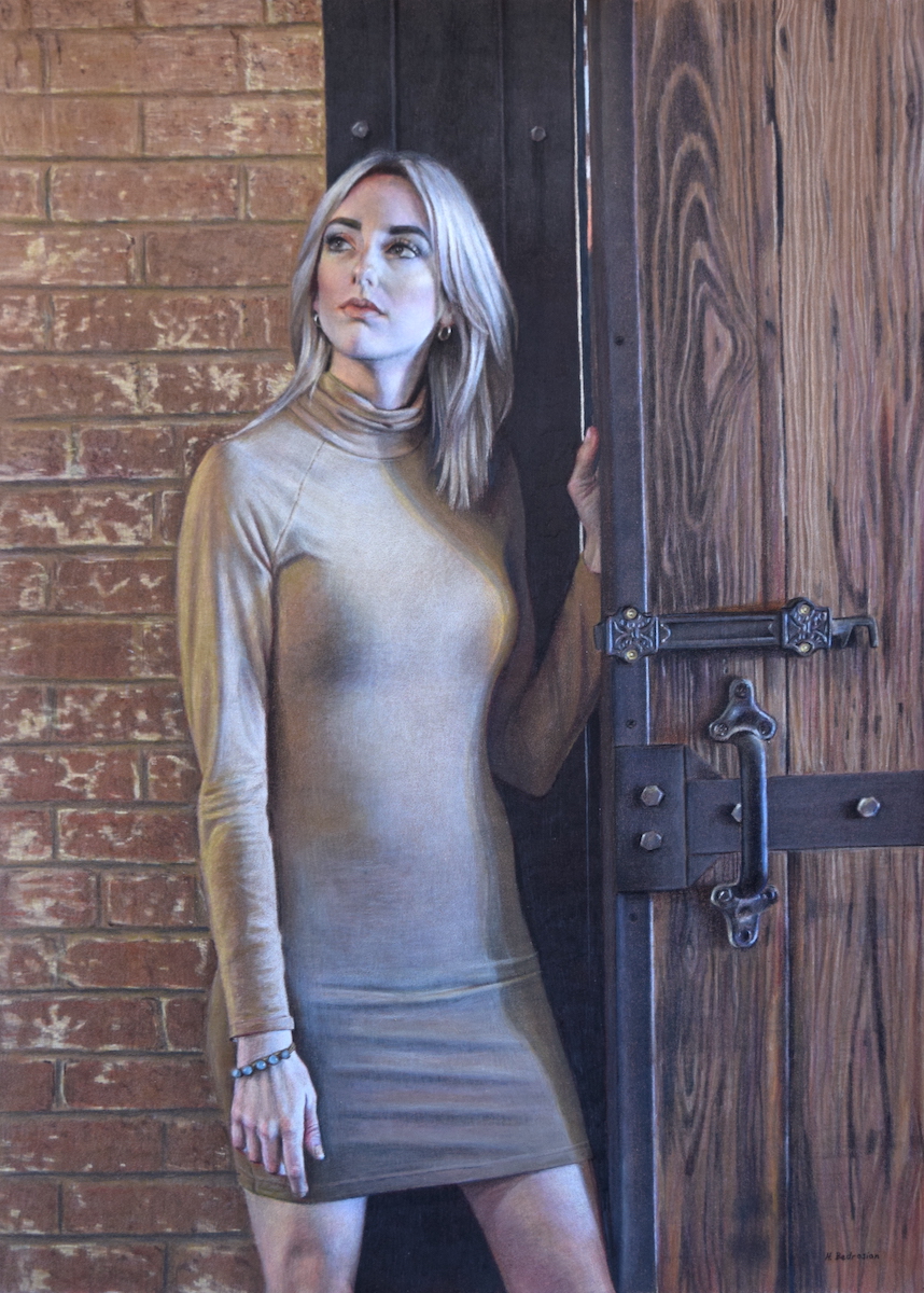
Last Chance, Sand Pastelmat, by Holly Bedrosian

The Best Colored Pencil Brands for Artists (2023)
8/25/2023 10:28:22 AM | By Holly Bedrosian | Comment on this
When it comes to choosing colored pencils, there are a dizzying number of options. However, after much research and experimentation, I have found that the best colored pencils for professional artists are the following:
3. Faber Castell Albrecht Durer Watercolor
4. Caran D’Ache Museum Aquarelle
7. Prismacolor Premier Verithin
I personally use a combination of different brands, as they each have their strengths. Some artists may may have a personal preference for one brand over the others for their color offerings, price, overall quality, or blendability, so I will go into more detail about each of the brands below to help you make an informed decision when purchasing your art supplies.
While reading the descriptions below, keep in mind your working style and priorities as an artist. Do you like to create tightly rendered photo-realistic work? Do you prefer looser more “painterly” or pastel-like drawings? Are you on a budget and looking for the most bang for your buck, or are you looking to invest in the highest quality regardless of price? Selecting the right colored pencil brand can help you achieve your artistic goals.
Prismacolor Premier are wax based soft core colored pencils offering 150 different colors to satisfy everyone from art students to professional colored pencil artists. These pencils have 7 mm barrel and a 3.8 mm core making them smaller than some other brands, but they are a good choice for budget conscious artists as they are the least expensive on this list.
I have grown attached to many of the unique colors offered and therefore keep a large supply of them for my colored pencil work. They are also offered open stock, so you can replace colors as needed.
In terms of lightfastness (degree to which colors fade over time), Prismacolor performs well overall, although some colors are not rated as highly as others. I have personally never had a problem with colors fading, but I also frame my artwork behind UV protective glass or plexiglass to hedge my bets.
These wax-based colored pencils can also be sharpened to a very sharp point for fine details, and yet have very soft leads allowing for smooth laydown and easy blending. These pencils can be applied with a light touch and in many layers, but they are not very forgiving in terms of adjusting mistakes as the waxy pigment seems to adhere very well to most surfaces.
There are a couple of things to note: the leads of certain specific colors are more prone to breaking than others (I’m looking at you, Tuscan Red!), and I have noticed that at least one color has changed slightly over the years (Beige Sienna). Also, be aware that Prismacolor pencils are prone to creating wax bloom, where the wax from the pencil rises to the surface of the drawing. But this can be dealt with, and I will cover that in a future blog post.
All in all, these are an excellent choice for their price, color selection and vibrant colors. Here is a drawing I did with all Prismacolor Premier colored pencils:

Still Life Sabotage by Holly Bedrosian
Faber Castel Polychromos are oil-based colored pencils, and boast a larger 8 mm barrell. These oil-based pencils come in 120 colors that are very much like colors you would expect in other artist mediums such as oil paint. They are also available open stock so you can purchase individual colors as needed.
These artist grade pencils have a more break-resistant core than softer core pencils, but still allow for smooth blending. The oil-based cores allows for especially smooth blending when used on sanded surfaces. When working on pastel (sanded) surfaces you do need to take care as the pigment will be very prone to smudging. But this is a great option if you like to work loosely in the beginning and blend existing pigment and tighten details as you work.
Additionally, unlike wax-based colored pencils, Polychromos are not prone to wax bloom. And, they can be used together with wax-based pencils. I will very often combine these with other brands when working on paper or slightly toothy surfaces.
When I want to achieve a looser pastel-like look, I use these on a sanded paper as in the drawing shown below.
The con to these pencils is that they are on the expensive side, although they aren’t the priciest on this list.
Here is a drawing I did using all Faber Castell Polychromos on sanded paper:

Patrick and Sloth by Holly Bedrosian
3. Faber Castell Albrecht Durer Watercolor
Faber Castell Albrecht Durer Watercolor pencils are durable water soluble pencils that blend beautifully when water is applied. These can be used in conjunction with other colored pencils, either as an “underpainting” or over an existing colored pencil drawing.
The core size is 3.8 mm encased in a large sturdy cedar barrell, and the leads are very durable as compare with other colored pencils. They are also lightfast and acid-free making them excellent professional quality colored pencils.
The price point for these pencils is the same as the Polychromos, making them somewhat expensive, but they are not the most expensive watercolor pencil option.
I used Faber Castell Albrecht Durer Watercolor colored pencils as an underpainting for this drawing:

Patrick Profile by Holly Bedrosian
4. Caran D’Ache Museum Aquarelle
Caran D’Ache Museum Aquarelle colored pencils are another water soluble colored pencil option with a 3.8 mm durable lead. These are lightfast colored pencils with rich pigments. Artists especially enjoy the opacity and brightness of the white pencil in this line.
Since these are available open stock, you can choose your favorites to add to your collection. They do come at a higher price point than the Faber Castell Albrecht Durer pencils, but if you are looking for especially vibrant colors, this may be the pencil for you.
Derwent Coloursoft are wax-based colored pencils with a large 8 mm barrel and a large 4 mm core. The soft cores allow for excellent blendability and layering.
These colored pencils are a great value (only slightly more expensive than Prismacolor), and I have found that they are less prone to wax bloom.
The cons are that these are somewhat prone to crumbling and do produce more dust.
Here is a piece I did using Derwent Coloursoft pencils in addition to other brands:

Hope by Holly Bedrosian
Caran D’Ache Luminance are the most expensive colored pencils on this list, but these wax-based pencils offer excellent lightfastness and vibrant colors that one would expect from professional-grade pencils.
Similar to the Polychromos, the Luminance pencils come in a wide range of rich colors. I especially enjoy the warm flesh tones available in this line.
The cores don’t seem quite as soft as Prismacolor, but the pencils do blend beautifully. For the rich pigment, durability, and lightfastness, the quality of these pencils can’t be beat.
The only drawback is the high price, so if you are unable to purchase the entire set, I recommend purchasing individual pencils that you will use the most to start.
Here is a piece I did using Caran D’Ache Luminance colored pencils in addition to other brands:
The Influencer by Holly Bedrosian
7. Prismacolor Premier Verithin
Prismacolor Premier Verithin colored pencils have a hard wax 2 mm core, making them excellent for fine detail work. They do not apply as smoothly as soft colored pencils, but they also do not crumble as easily.
I used these pencils a great deal in the beginning of my career, but as my style has become slightly softer and looser, I have transitioned to using more of the above brands. In addition, it is difficult to cover large areas with these fine points, so it’s best to reserve these for detail work or very small drawings.
On the negative side, the colors aren’t as rich as the corresponding colors in the Prismacolor Premier collection, but you can achieve the same vibrancy if you combine the two.
Here is a piece I did using Prismacolor Verithin pencils along with Prismacolor Premier pencils:

Brass Ensemble by Holly Bedrosian
So there you have it – my favorite colored pencils for artists! If this the choices still seems daunting, remember that you can create amazing art with just about any colored pencil brand. Sometimes you just have to dive in and give it a go, and everything takes practice. Next time I will be covering the best surfaces to use with colored pencils, so be sure to subscribe to this blog so you don’t miss it!
Topics
Archives
Recent Works |
|||

|

|

|

|

|

|

|

|
