Blog

Drawing the Hand in Colored Pencil
9/28/2023 9:25:12 AM | By Holly Bedrosian | Comment on this
People often ask me about drawing hands in colored pencil. Hands are my favorite thing to draw! To me, hands are similar to the face in that they have interesting contours, folds and wrinkles to render, and yet don't carry the same weight in terms of depicting a likeness. That being said, people do say my hands look just like the people's hands I've rendered, perhaps because I don't feel this pressure and just enjoy the process.
First of all, as I wrote in my post about Drawing the Face in Colored Pencil, the most important skill to learn is how to draw the hands in graphite. Practice drawing the hand by breaking it down into basic shapes taking note of the size proportionality of the fingers to the entire hand, the width of the hand to length, etc. Also take note of angles relative to one another. Practice the hand in various positions.
Once you have mastered this skill, it is time to apply colored pencil. In the demo below, I will be sharing a colored pencil drawing step by step that I did from life of my left hand (I draw with my right). This demo with be done on a white paper with a sanded surface. When choosing surfaces, I find that sanded surfaces allow me to work quickly. If you are unsure of the best paper to use, refer back to my post on The Best Surfaces for Colored Pencil.
The pencils I used for this drawing are Faber Castell Polychromos.
I like to start with the darkest values to define the contours and shapes. Here you can see I've laid down the darkest areas by applying a dark color with heavy pressure. I have also started to suggest the mid-tones by applying this dark color with a lighter pressures, and I have reserved the white of the paper for the lightest values. I am working from life here, but if you are working from a reference photo, resist the urge to use black for this step, as softer hues such as dark umber are more realistic for the darkest darks.
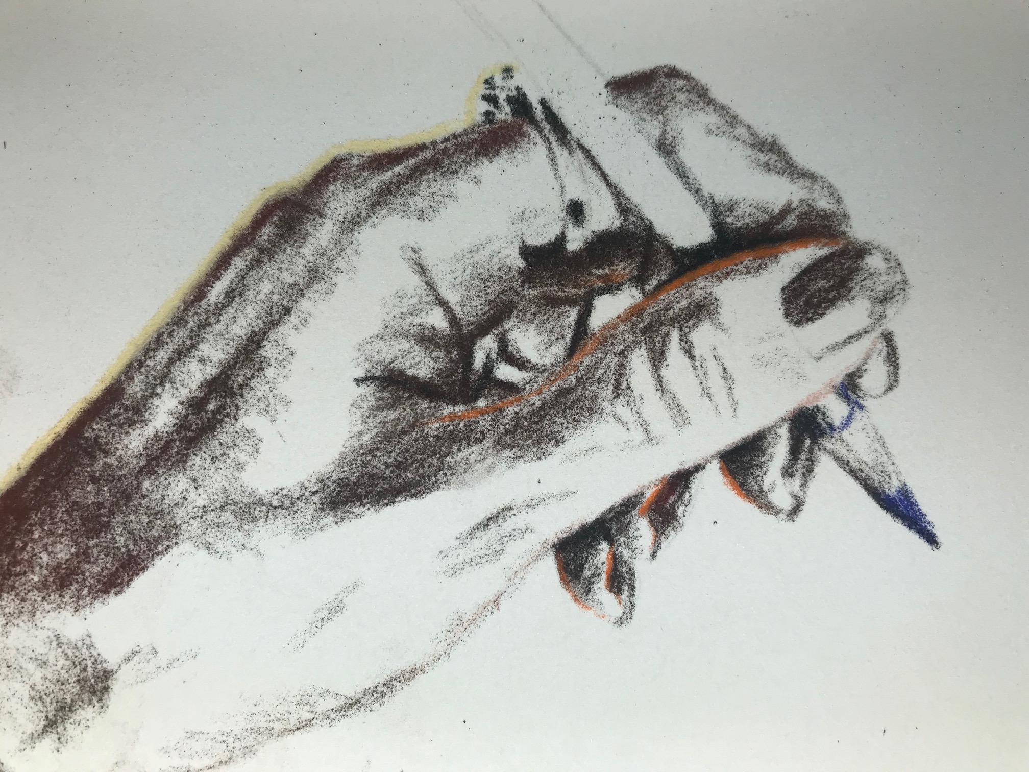
In the second step, I begin applying the first layer of the mid-tones. I am not too worried about texture at this point, as I will be applying several layers later on. I am using bright reds, oranges, pinks, and tans here. I am also using the bright purplish-blue color for the pencil, and also sparingly in the skin tones to create harmony in the drawing.
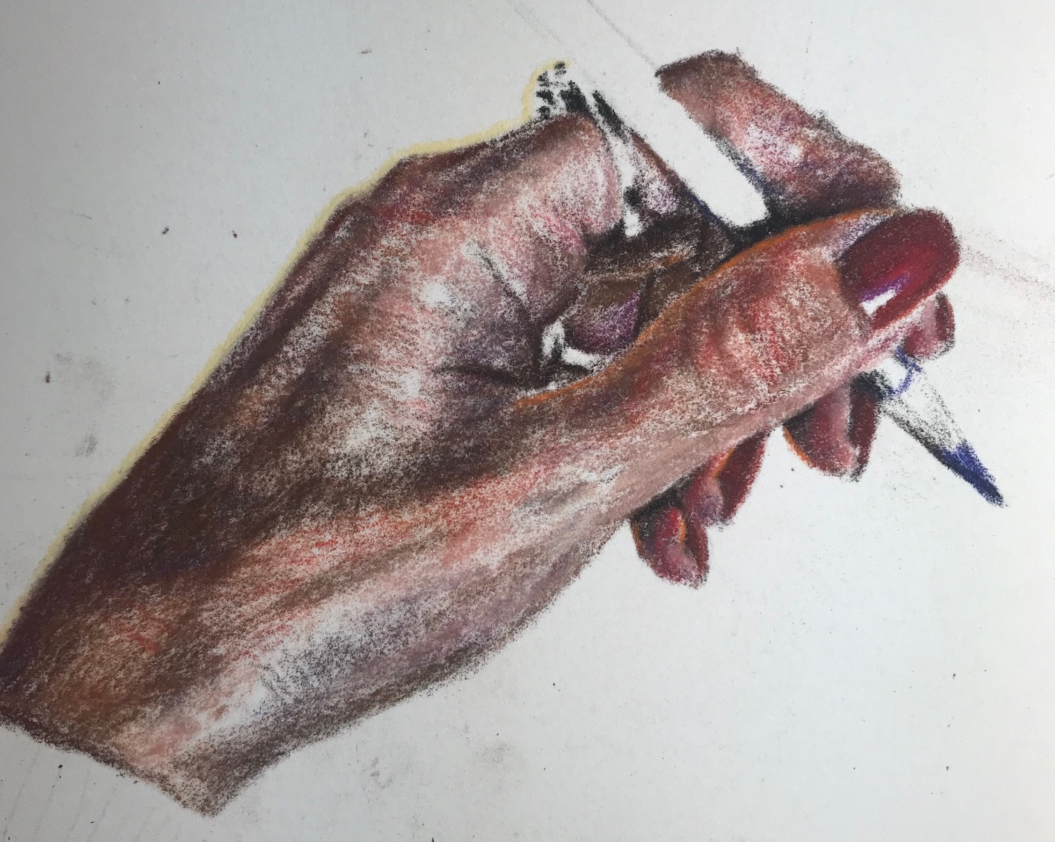
As I continue to work on the mid-tones, I begin adding some lighter flesh tones to blend the colors together. I don't need to use a separate blender one this surface, as the pencils themselves create a smooth finish when applied in layers.
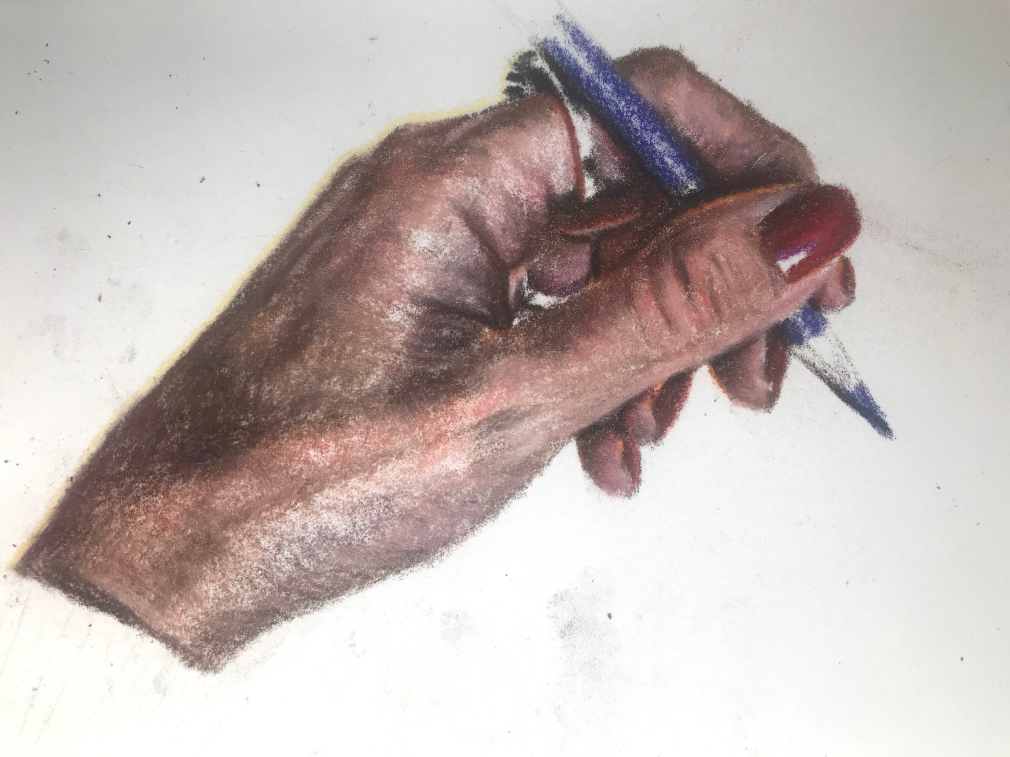
In the next photo, I am continuing to work the lights, while going back and adding dark and mid tones as needed. Sometimes establishing the lights will help you to see where more contract and depth is needed in the darker areas. I will keep the bright shine of the ring as a lighter value than the rest of the hand so that it really seems to shine.
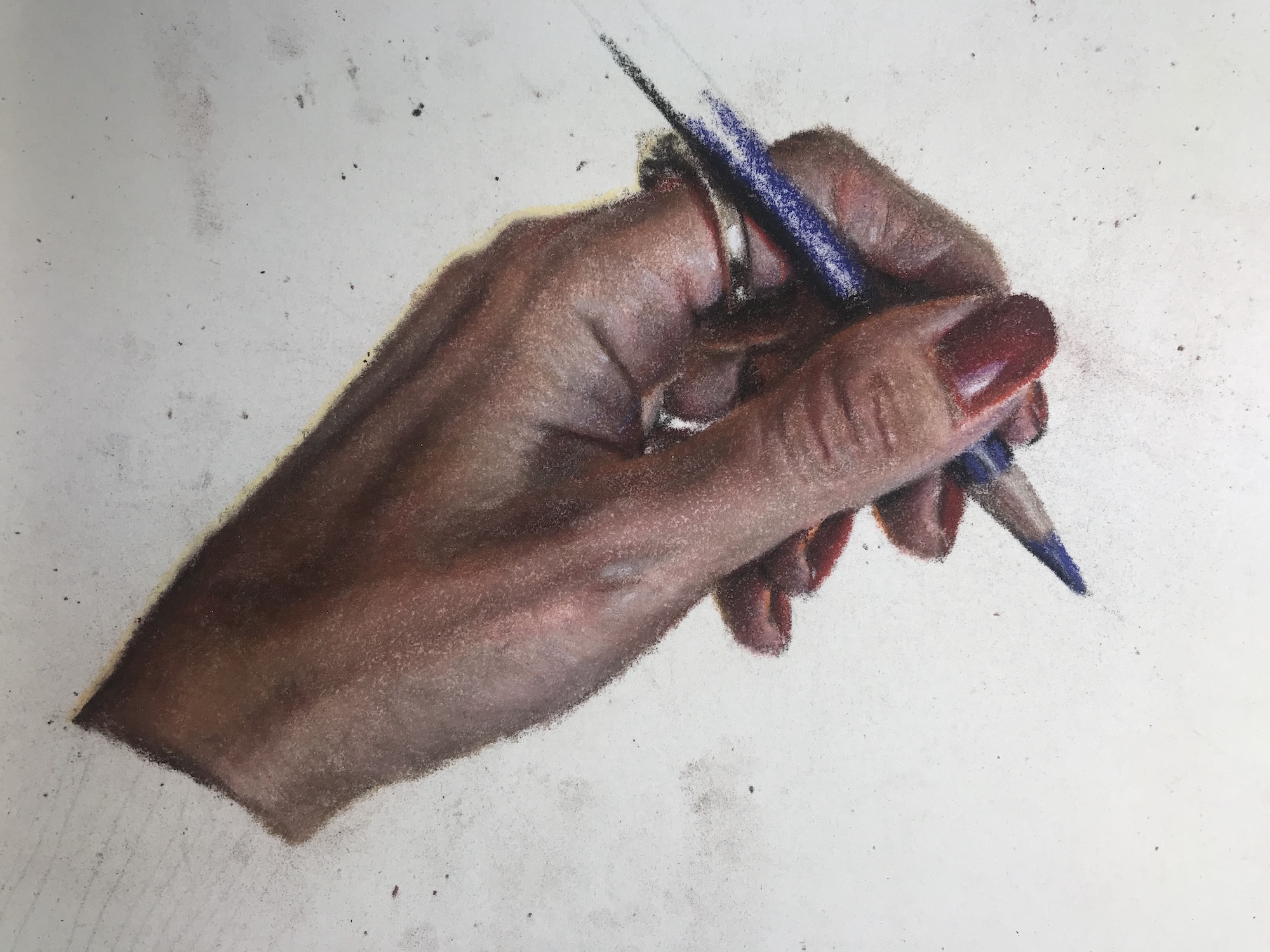
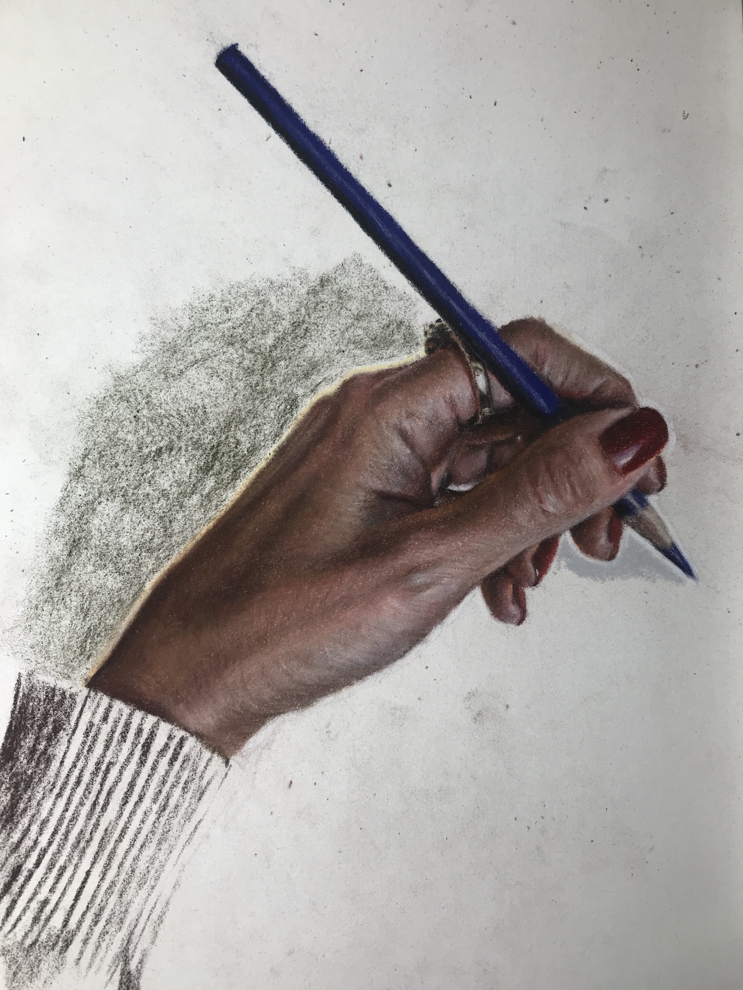
In the photo below, I am starting to establish the background shadow to show that the hand is drawing on a white surface. I am also beginning to show the texture of the sweater cuff, again starting with the darkest colors for the shadows. Here I am also starting to use directionality of the pencil strokes to show contours of the hand and wrinkles in the skin.
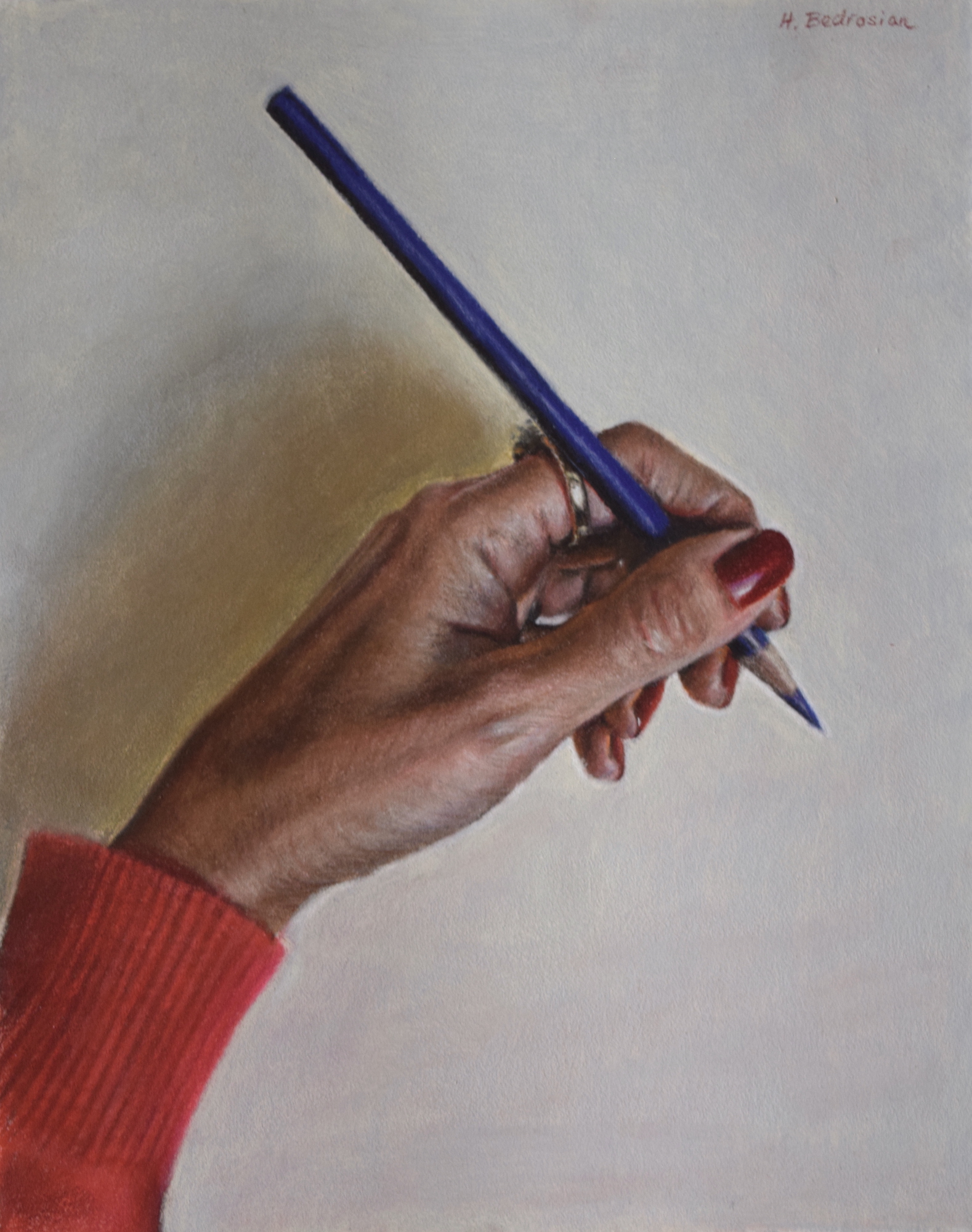
In the final photo, I have completed the hand, background, and sweater.

AWA 2023 Annual Online Juried Show Acceptance
9/18/2023 2:25:40 PM | By Holly Bedrosian | Comment on this

I am excited to announce that my colored pencil drawing, Exuberance, has been juried into the American Women Artists 2023 Annual Online Juried Show! This show features various artwork by American women artists and will be online at https://americanwomenartists.org/current-exhibitions/ from September 18th 2023 through September 18th 2024.

Creating Realistic Skin Tones in Colored Pencil
9/14/2023 8:49:03 AM | By Holly Bedrosian | Comment on this
A question I get a lot is how to create realistic skin tones using colored pencils. I believe most people are looking for a set of colors that will render the most realistic portrait, but there is more to it than that.
Firstly, the most important thing in a portrait is accurate proportions and value. Without this, skin tones are meaningless. Once you have mastered this however, skin tones and colors in general can be a fun way to play with different colors and achieve beautiful, harmonious skin tones. Refer to my post on Drawing the Face in Colored Pencil for more on that.
As I mentioned in Drawing the Face in Colored Pencil, I begin each portrait with the darkest tones. This first layer will usually be a color such as dark umber in Prismacolor Premier, dark sepia in Faber-Castell Polychromos, or sepia in Caran D'Ache Luminance colored pencils. This step is very important as you are laying down the darkest areas and therefore beginning to establish accurate values.
The next step is to move on to the mid tones. Human skin is not monochromatic - if you really study the face, you will see a variety of colors comprising the skin's undertone. I will often use the same colors but in different ratios for different skin tones.
Note that reference photo will change how the skin tones look when compared to real life. I notice that often shadows will become too dark and/or warm in photos. Reference photos will also often increase contrast. Take this into consideration when choosing your colors and values.
For the medium tones, I prefer to start with bright reds and browns, then working my way toward earthy greens and yellows which are often found in shadows. Don't limit yourself to "flesh tones"! In Prismacolor Premier colored pencils, some of my favorites for this step are burnt ochre, burnt sienna, Poppy Red, Carmine, Sandbar Brown, Bronzer, and Yellow Ochre. For Faber-Castell Polychromos, I like colors such as copper, deep red, green gold, indian red, light cadmium red, and light yellow ochre.
In addition to these warm skin tones, I also pay attention to the subtle cooler tones that peek out near the hairline, under the eyes, and above the eyebrows. Be judicious when applying these colors as a little goes a long way and most people don't have too much blue in their skin.
Layering is what really makes skin tones come to life. Sometimes you can layer bright reds, brown, and even blues and greens with a tan, cream, or peach shade and create beautiful prismatic effects.
People often ask me how I achieve a smooth look to the skin. This really depends on the paper, but layering is key. Below I show how I use layering on a sanded surface.
The first photo shows the early phase where I was just working quickly to get the colors down. You will notice what looks like many bright primary colors! These colors will become less distinct in the next step. Also, the overall color appears too dark, but I will blend these colors with lighter tones in the next step.
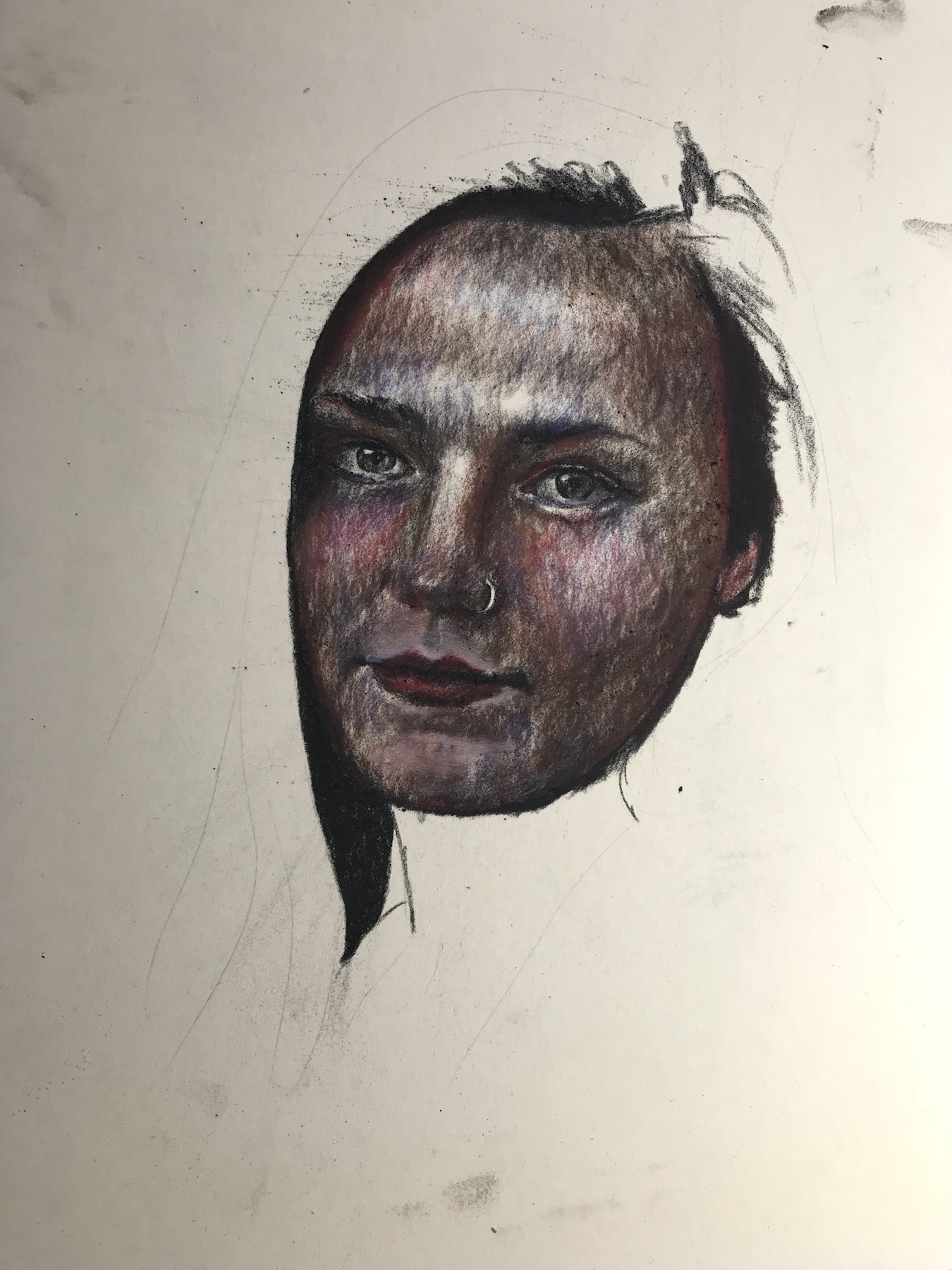
The second photo shows after I used lighter colored pencils to blend the midtone colors together and create a smooth skin tone. I didn't use any blenders other than the colored pencils themselves!
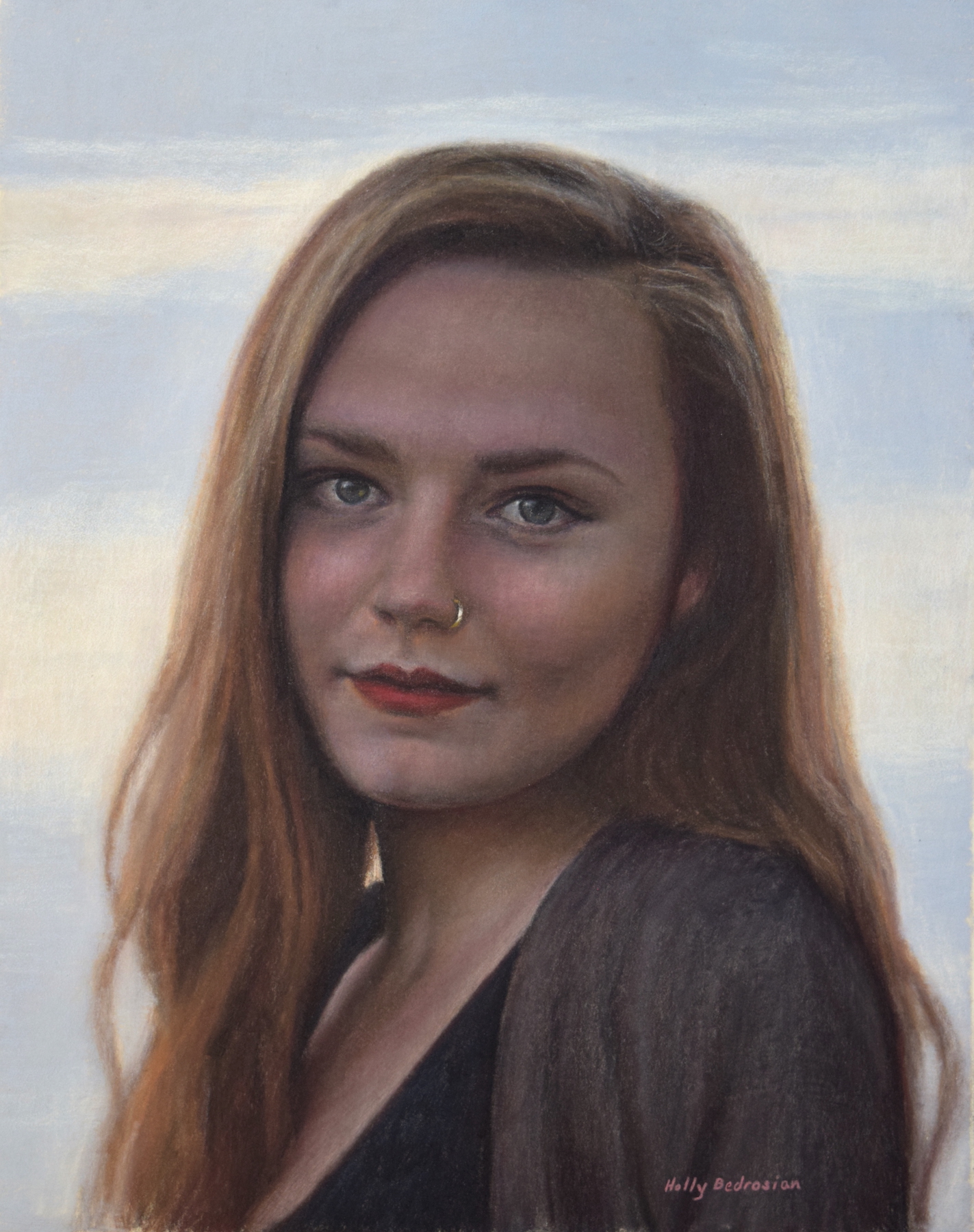
For the lightest colors, I choose shades such as Prismacolor premier beige, light peach, cream, salmon pink, nectar and ginger root. Sometimes I also use cool grey shades as a cool highlight color as well, depending on the light source. If I am working on a smooth paper, I will have reserved the white of the paper for these areas, but even so, I like to use the lighter shades over the medium tones to create a smooth look.
In the photos above, the subject is in the shade with a bright sky behind her, so the skin tones appear darker. This may look scary as in the first photo, but once the lightest colors were applied and framed by the shadow of her hair, the colors look correct.

Fixing Mistakes in Colored Pencil
9/6/2023 7:37:44 PM | By Holly Bedrosian | 1 Comment
Don't - embrace your "mistakes" as beautiful, intentional marks! Just kidding, well kind of. I do like the look of whimsical colored pencil strokes combining in a chaotic yet beautiful way to create a realistic image, but if you find that you have made a mark that you just cannot live with, read on.
First of all, colored pencil lead is not the same as graphite pencil lead in that it won't erase easily with a standard rubber eraser. This is why I recommend starting with an accurate line drawing in graphite pencil before applying the colored pencil. In addition, you may want to use a light pressure for the first few layers in colored pencil so that this pigment is more easily removed if you decide to make a change.
Also, work the larger shapes in the beginning and leave the fine details to the end, when you have a good idea of the overall proportions and layout in your drawing.
How you correct your mistakes will partly depend on the materials you are using. If you are using paper such as Bristol Board, the following may be helpful for removing or reducing unwanted marks on your colored pencil drawings:
1. Kneaded eraser
This type of eraser can be molded into a small shape to fit the mark that you are looking to remove. You can gently rub the erase over the area you are looking to remove, and it won't damage the paper or smudge the pigment like a regular rubber erase will. However, this type of eraser will not completely remove the pigment, particularly on areas with layers of color.
2. Plastic eraser
Plastic erasers are designed to remove both pencil and colored pencil pigment without smudging the pigment. The eraser below does a good job of removing light layers of colored pencil pigment on smooth surfaces.
3. Electric eraser
Slightly more expensive, an electric eraser can make the job much easier. Electric erasers do the work for you and also have a precision point.
For textured surfaces such as sanded paper or pastel paper, erasing is not the best method for removal as it may disturb the textured surface. Also, on sanded papers the pigment is not as "stuck" to the surface of the paper, particularly in areas that have not been burnished (colored pencil applied with heavy pressure). Here are a couple of ways to remove pigment on textured surfaces:
4. Artist tape
Applying tape to the area you want to remove and gently lifting it off the surface is a great way to remove pigment on sanded surfaces. This type of tape is specially design for art use as it has low tack and will not leave a residue on the drawing surface. You can apply the tape several times to remove more pigment. This will work especially well for colored pencil applied with a light touch.
5. Poster putty
Poster putty can be molded to the shape of the mark that you want to remove and applied to the paper one or more times to remove pigment. This is the best way to remove pigment from a sanded surface, in my opinion. I keep a good amount of putty on hand for this purpose as well as to hang my artwork on the wall or outside window to photograph it. Putty will not damage walls or your paper and it leaves no marks behind. Again, this method is best for removing pigment that is not applied with too much pressure.
6. Workable fixative
If the paper has lost its tooth, you may be able to restore it by applying a workable fixative. Be sure to do a test on a separate sheet before applying the fixative to your artwork.
7. Use color theory
You can adjust the color by applying a color opposite on the color wheel. If you find that the tone is too blue, you can apply a thin layer of orange to bring it back to neutral. Be aware that this will not change the value. Consider the complementary colors red/green, blue/orange, purple/yellow when making color adjustments.
8. Use mixed media
If you cannot remove the existing colored pencil nor apply more pencil on top, consider adding another medium like acrylic. Also consider trying a white gel pen for adding thin white lines such as whiskers.
9. Start over
This is probably not what any artist wants to hear, but sometimes the only real solution is to start over. If you have tried the above tricks and are still not happy with your drawing, your sentiment will most likely not change when it is completed. Spending more time on a drawing that you are consistently not happy with will only cause more frustration. Also, sometimes it's best to start anew with "fresh eyes"!
Before you start over however, take a good look at what you don't like about the drawing. Is it the composition? The lighting? The values? Sometimes doing a small color sketch first can help you work out problems before working on the final piece.
Happy drawing!
Topics
Archives
Recent Works |
|||

|

|

|

|

|

|

|

|
